Saturday Update 13 / 08
Saturday Update: Battle backgrounds
The Old
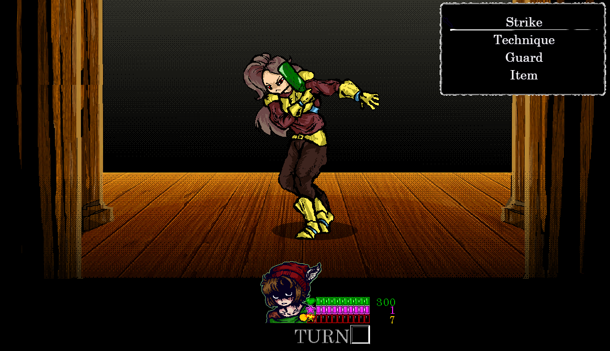
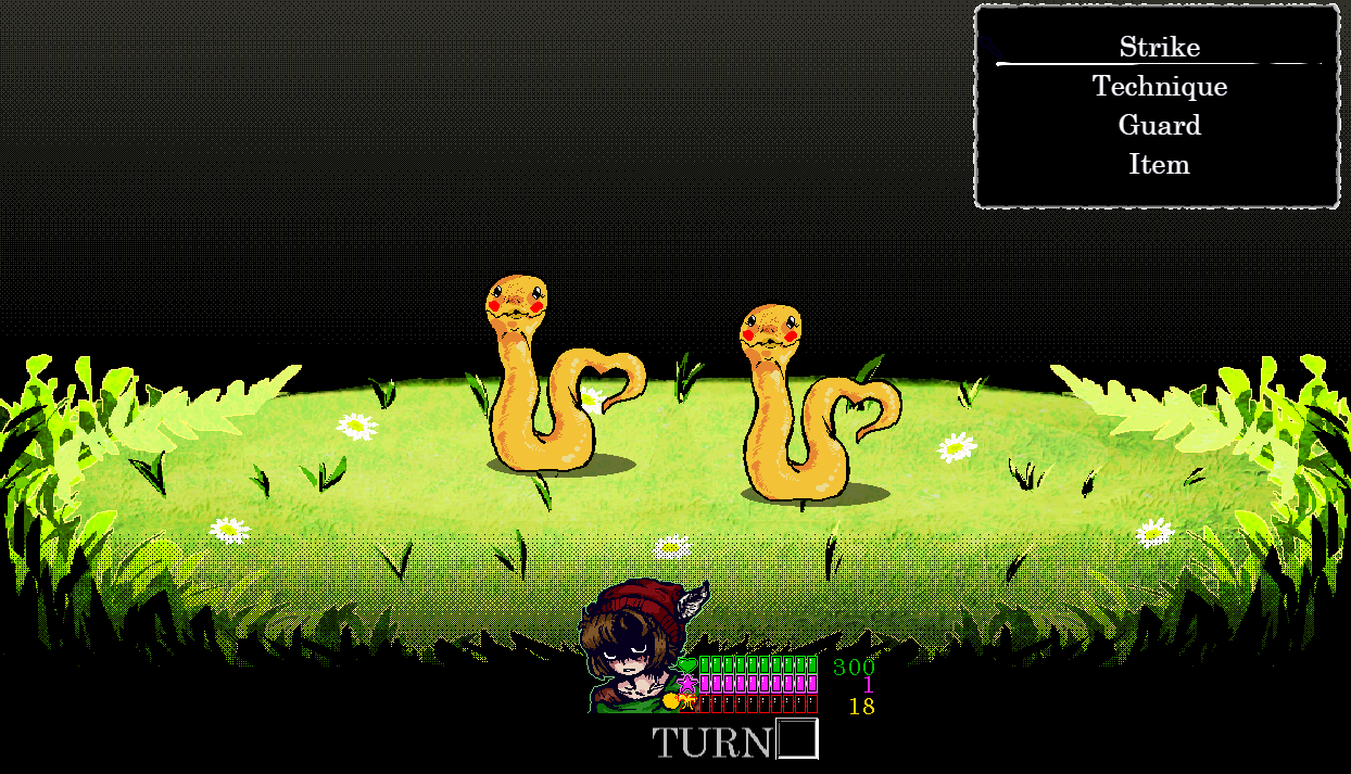
Before then, the graphics belonged to the "Time Fantasy" Pack, a very saturated and vibrant tileset that had a variety of colorful items and landscapes to pick from. As such, the battle bagrounds needed to be equally as vibrant in color, but still have a tint of black to disassociate the players from focusing at anything other than the enemies that they were fighting, since that is and always will be the main concern. Some examples on how they onced looked can be shown below:


The general layout remains the same, the lower parts of the screen remaining black so the characters health, magic and adrenaline bars are easier on the eyes. Furthermore there is no backgrounds otherwise it'd be too cluttered, therefore there wouldn't be any predominant focus anywhere around.
The New
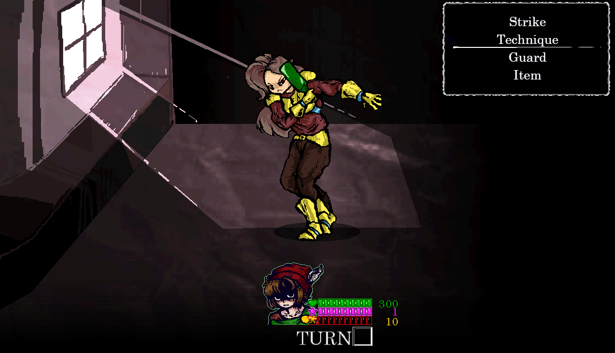
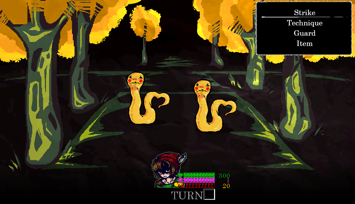
The new asthetic is autumn. The colors are still vibrant, but the color scheme has changed a little bit with handmade sprites getting the 1940's Magitech asthetic the game's going for.
Whislt still generalist, displaying areas of interest, the color scheme has changed to let the black flow and contrast well with the backgrounds, not as a form of background limitation, but as a complementary color to the scene.


The changes are visually drastic. But they're far more fitting to the general idea that the game has going on. I chose it to be this way so the black is included, the bars are far more easely read and the newly implemented enemy health bars are also easier to see.
The single rule i'm implementing is a lack of clutter. Everything needs to be simple in the way it's drawn. No more than 3 colors. A base color, a highlight and a darker color. Also having a texture akin to a page from a book, to go along with the new battle transition, focusing a little bit on the idea that this battle is being narrated by someone.
Personally, I feel like this is far more fitting than the prior ones, with far more personality and that it can carry an identity of its own and to stand out more. There'll be no need for many battle backgrounds in Finest Fable, but I hope that the ones present are enough to carry the game's asthetic through the end.
Get Finest Fable
Finest Fable
Legendary Hero of Light gets kicked by a Drunk.
| Status | In development |
| Authors | TotsPoli, Gimpy |
| Genre | Role Playing, Adventure |
| Tags | Comedy, Pixel Art, RPG Maker, Turn-based Strategy |
| Languages | English |
| Accessibility | Subtitles, High-contrast |
More posts
- Progress for the 'PT' Update.Nov 23, 2024
- Updated to Version 1.1.1Aug 04, 2024
- Updated to Version 1.1.0Jul 04, 2024
- Updated to Version 1.0.6Feb 09, 2024
- Updated to Version 1.0.5Jan 11, 2024
- Updated to Version 1.0.4Dec 12, 2023
- Updated to Version 1.0.3Dec 10, 2023
- Updated to Version 1.0.2Dec 05, 2023
- Updated to Version 1.0.1Nov 30, 2023
- The Finest Fable Demo is out!Nov 25, 2023

Leave a comment
Log in with itch.io to leave a comment.